UniTeller Digital Link
A white-label platform that lets banks and partners launch their own branded remittance app, from onboarding to first transfer.
Project
Role: UX Design Manager, leading UX for every partner launch
Team: My design team, working with Product, Engineering, Compliance, Sales, and partner teams
Market: Financial institutions and partners worldwide
Timeline: 2018 to present, ongoing as new partners launch
Results:
2.1M partner transactions in 2024, nearly 2x the annual goal
New partners launch on a shared system, not a custom build
The business problem
Digital Link lets banks and financial partners offer remittances under their own brand, powered by UniTeller’s infrastructure. Every partner wanted something different: their own brand, different services, sometimes a website, sometimes just money transfers. Designing each one from scratch was slow, inconsistent, and hard to maintain, and in a regulated product, every inconsistency is a compliance risk.
The scale behind every partner launch: one platform, 120+ countries, and five services partners can choose from.

What I owned
I’ve led the UX for Digital Link since 2018. For every new partner, I own the key experience decisions: how their brand comes to life, whether they need a website, which services they’ll offer, and how their app should work, from onboarding to first transfer. My team turns those decisions into the final designs.
Key decisions
1. One reusable white-label system instead of custom designs per partner.
We built a shared design system with a brand layer on top. Each partner gets its own colors, logo, and content, while the flows, components, and compliance logic stay the same. New partners launch faster, and every improvement reaches all partners at once.
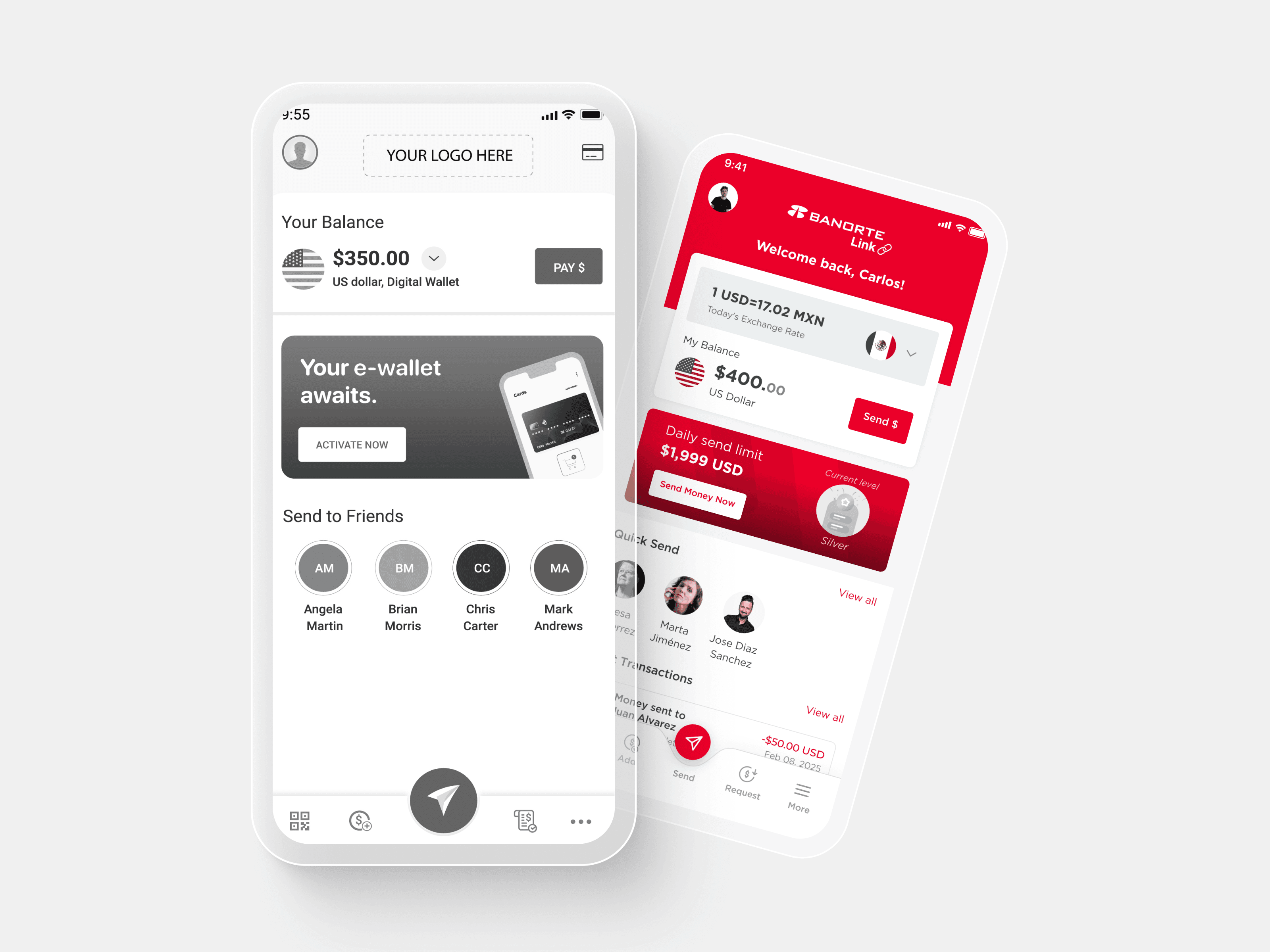
One system, many brands: each partner app shares the same flows and components, with its own branding on top.

2. Scope every partner’s needs upfront.
At the start of each launch, I work with the partner and internal teams to define their services (send money only, or more), their branding, and whether they need a website. Clear scope early means fewer changes late in the build.
3. Keep compliance consistent across every brand.
KYC, verification, and transaction checks live in the shared system, not in each partner’s design. Every partner app follows the same compliance rules, no matter how it looks.
A full partner launch: branded onboarding, transfers, and wallet, built on the shared system.

Partner websites
Some partners need a web presence beyond the app, so we offer a dedicated website as part of the white-label service: design, development, and ongoing maintenance. I define what each site needs to communicate and how it connects to the partner’s app, and my team designs and builds it on the same shared components. The result is a professional, responsive site that reflects the partner’s brand, explains their value clearly, and guides customers to download the app and send their first transfer.

How do I led the work
Set the standards and components my team uses to design every partner launch.
Acted as the UX point of contact for partners, translating their business goals into product decisions.
Partnered with Engineering so the white-label system could be configured per partner, not rebuilt.
Impact
2.1M partner transactions in 2024, nearly 2x the annual goal
Partner launches went from custom builds to a proven, shared system. Every improvement to the platform now reaches all partners at once, and new partners go live on flows that are already tested and compliant.
What I learned
The best way to give every partner something unique is to standardize everything they don’t see. A strong shared foundation is what makes fast, branded launches possible.