Oh My Card!
Building a new consumer gift card app following a company acquisition, redefining how users in Guatemala discover, purchase, and redeem digital value through a localized and intuitive experience.

Project
Company: UniTeller
Industry: Digital Gift Cards, SaaS, Fintech
Scope: App UX Restructuring
Market: Guatemala
Role: UX Designer
Focus: Step reduction, flow consolidation, mental model clarity
Impact: Shortened primary transaction journey
Overview
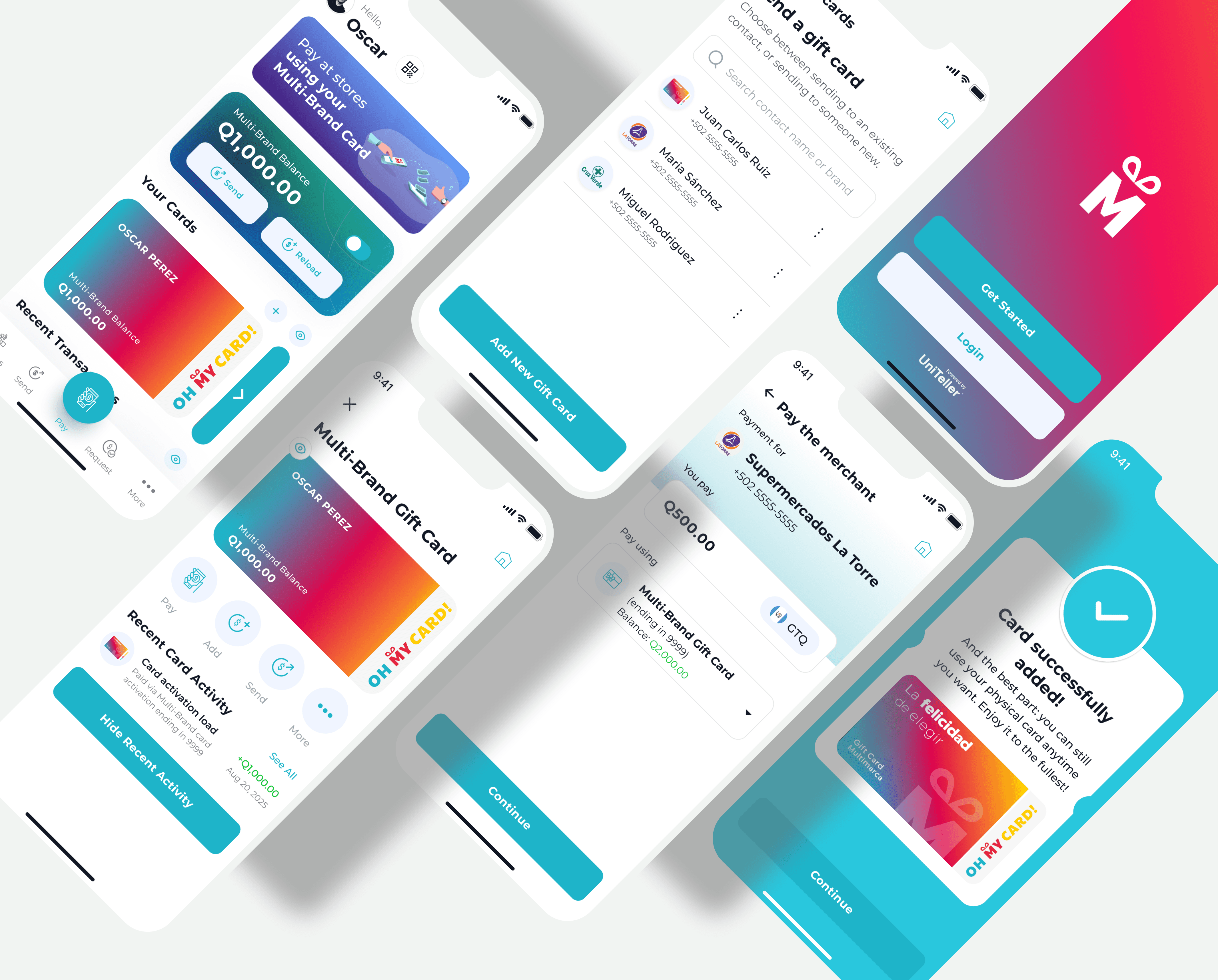
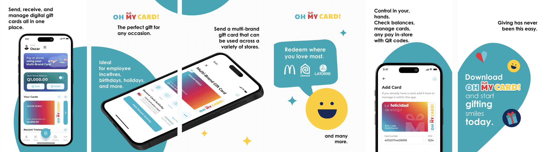
Simplifying an acquired gift card experience for the Guatemalan market. Oh My Card! is a digital gift card service available in Guatemala that allows users to purchase, send, and redeem prepaid value.
The service existed prior to acquisition, but only had a website. After it was acquired, a new app experience is under develop to modernize the product and better align it with the broader digital ecosystem.
I partnered closely with Product and Engineering to simplify and restructure the user experience within the new app. My focus was on reducing friction, consolidating flows, and clarifying how the product works for end users.
This is a structural UX effort, not just a visual refresh.
The Challenge
As an acquired product, Oh My Card! presented unique constraints:
• Legacy user expectations
• Pre-existing system logic
• Technical limitations
• Localized market behavior in Guatemala
Leadership identified the need to “make the experience simpler.” The challenge was translating that direction into concrete UX improvements without disrupting underlying systems or user trust.
Solution - UX Restructuring & Flow Optimization
Removed Redundant Steps
The original experience was a website that contained unnecessary transitions and intermediate confirmations that extended task completion time.
I analyzed the full journey and removed redundant steps while maintaining necessary validation and compliance checkpoints.
Result: an app with a shorter, more direct transactional path.
Combined Fragmented Flows
Previously separated processes were logically part of a single user task.
I unified these into cohesive journeys aligned with how users naturally think about buying and sending a gift card.
Result: reduced cognitive load and improved task continuity.
Clarified the User Mental Model
The legacy structure positioned the product in a way that felt procedural rather than intuitive.
I helped reframe the experience around clear user goals:
• Select value
• Send intentionally
• Redeem confidently
By reshaping the flow around user intent rather than system logic, the product became easier to understand and navigate.
Operational Impact
Measurable improvements included:
• Reduced number of steps in primary transaction journeys
• Fewer transition points between tasks
• Clearer progression from purchase to confirmation
• Smoother engineering implementation due to simplified flow logic
• Reduced cross-functional clarification cycles during development
The result was a more efficient and modernized experience built on top of an inherited system.
Outcomes
This project demonstrates:
• Cross-functional UX leadership
• Flow simplification within a post-acquisition environment
• Step reduction and journey optimization
• Behavioral UX thinking
• Execution within technical and legacy constraints
Rather than redesigning aesthetics, I helped digitalize the service completely, improve structural clarity, and user comprehension in a transactional financial product.
